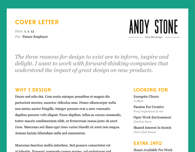
When applying for a job in a creative field, the design of your resumé is just as important as the words on the page. While some designers go overboard with beautifully rendered charts, background images, and infographics, I think that you can create a lasting impact with beautiful typography and a logical layout. When sending a resumé, it is also important to remember that it might be printed on poor quality paper or in black and white—so always create a design that still looks great even under these circumstances.
This download is a modified version of the resumé that I used for my last two applications and has been used by a number of friends in Boulder to successfully get their positions. While they were also very qualified and deserved the job, it was nice to have a head start by standing out from the rest of the crowd.
I modified the typography on this design away from Gotham, Knockout, and Skolar to Edmondsans, Muncie, and Georgia. I didn’t want to distribute a design that would require hundreds of dollars in typographic investment, and I tried to find close matches were possible. I did keep the original color scheme because the orange is eye catching but still prints very well even on older and cheaper printers.

The template includes a full resumé and cover letter design in a single InDesign document. The cover letter breaks up the content in to Why I Design, My Results, What I’m Looking For, and Extra Info. The two column layout focuses on what is important to you as well as showing your personality off to the company. The cover letter and the resumé are each one page to increase the chances that they will be read all the way through; I find it best to keep resumés and cover letters short to really focus on the three things that make you a great hire.
Thank you so much for your interest. I will be releasing templates for proposals and invoices early next week, so please check back.
If you liked this article, let me know. You can find me on twitter.
